The 9:30 Opening-Range Breakout Is Just Long the Market in Disguise
Everyone posts the 9:30 candle. We tested it on three years of 1-minute data for all three big US indices, before writing any EA code. When price closes outside the opening range, it does not keep going in either direction, on any index. The only profit came from buying a market that was going up.
Does the 9:30 opening range breakout work?
Not as a breakout. We looked at about 700 breakouts per index on the Nasdaq 100, Dow and S&P 500, 2019 to 2021. When price closed outside the opening range, it did not keep going on any of them. The only profit came from buying a market that was going up.
What is the opening-range breakout?
The opening-range breakout (ORB) is one of the most shared day-trading strategies on the internet. The idea:
- The US stock market opens at 9:30 New York time.
- Mark the high and the low of the first few minutes. This is the opening range.
- Wait for a candle to close above or below that range. This is the breakout.
- Trade in the direction of the breakout and ride the move.
You see it everywhere as the "9:30 candle", the "15-minute ORB" or "the NQ open". There is also real research behind it. Zarattini, Barbon and Aziz tested a 5-minute version on 7,000 US stocks from 2016 to 2023. They reported a 33% annualized alpha (extra return per year, above the market). An older study found the same pattern on index futures in five countries.
How we tested it
We tested it on the markets where most retail traders use it: the three big US indices, the Nasdaq-100, the S&P 500 and the Dow. We used three years of one-minute data, 2019 to 2021. This is our in-sample period, the years we are allowed to look at while we study an idea.
We started with the cheap test, before writing any EA (Expert Advisor, a program that trades for you in MT5) code. If the effect is not even in the raw price data, there is nothing to automate.
We used the standard rule:
- The opening range is the first 15 or 30 minutes after the 9:30 open.
- When a 15-minute bar closes outside the range, that is the breakout.
Before thinking about targets and stop losses, we asked one question: after price closes outside the range, does it really keep going?
The breakout does not continue
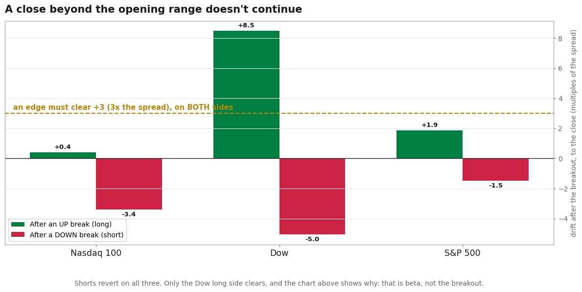 Price move after the breakout, held to the close, measured in multiples of each index's spread so the three can be compared. A real edge needs to be above +3 on both sides. Shorts move back on all three; only the Dow long side passes, for a reason the next chart makes clear.
We looked at roughly 700 breakouts per index in three years. The answer is no, and it is the same on all three indices.
- After a break upward, price moves only a little further by the close.
- After a break downward, price does not continue at all. It goes back the other way. On the Nasdaq, downside breaks lost about 5 points of their move by the close. On the Dow, about 5. On the S&P, about 1.
An edge worth automating should make roughly three times the spread (the cost to trade). It should do this on both sides, because the range does not know if the news was good or bad. On the short side, not one index passes.
So a close outside the opening range tells you nothing about where the rest of the day goes.
There is one green bar above the line: the Dow's long side. Remember it. It is not what it looks like.
Case 007 in one PDF: the exact rules, how we tested them, and what we found. Free with your email.
The only thing that "works" is buying the market
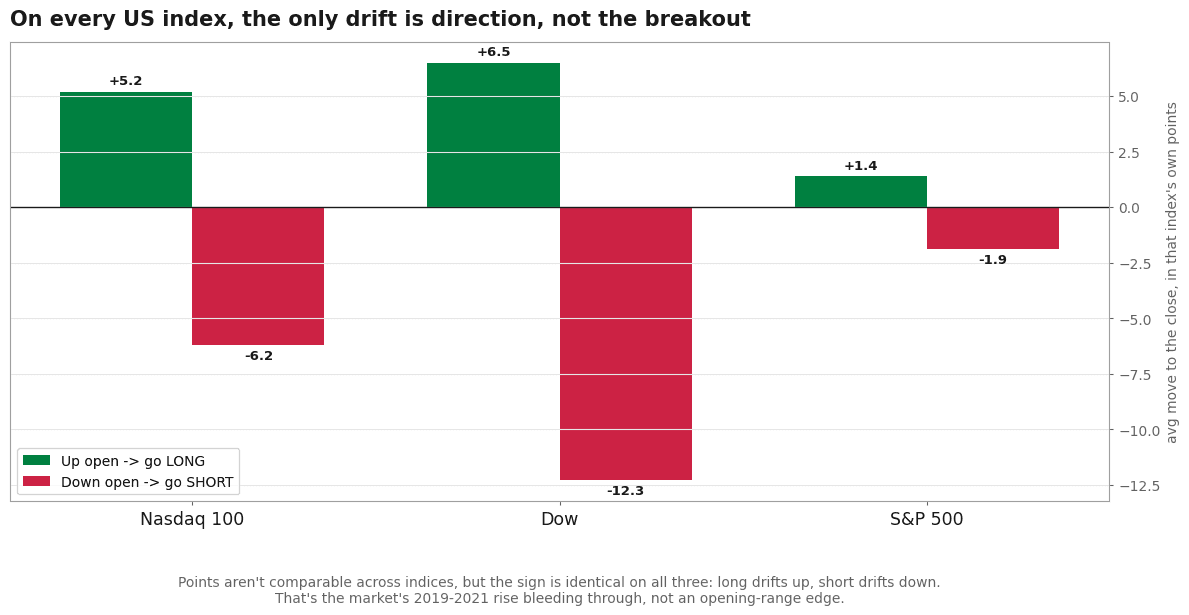
This one number explains every viral ORB backtest. And it is the same on all three indices.
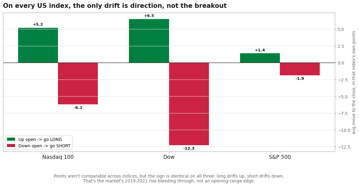 On the Nasdaq, the Dow and the S&P, buying after an up open makes money and shorting after a down open loses money. The result is the same on all three, which tells us this is market direction, not an opening-range signal.
- Buy after the opening range closes up, hold to the close: you make money on every index.
- Sell short after it closes down: you lose money on every index.
A real opening-range edge would make money on both sides. This one only makes money on buys. And the only reason is that all three indices went up from 2019 to 2021.
That is also why the Dow's long side looked good in the first chart. The Dow had a strong trend up. So buying its up opens simply followed that trend.
You are not trading an opening-range effect. You are just buying the index in a rising market, with more work.
So where do the viral numbers come from?
If the breakout has no edge, why does every ORB backtest look amazing? There are four reasons, and none of them is the breakout.
1. The stop and target placement. Put the stop loss at the other end of the range and the target two ranges away. Now the simple version makes a very small profit. But the target is doing the work, not the signal. On the Nasdaq it makes three cents per dollar risked before commission. With a normal commission, it loses money. It is not even stable from year to year: it made money in 2019 and 2021 and lost in 2020. It is a coin flip where the target placement decides the payout. Critics of the strategy have said this for years.
The other three reasons explain how the famous results get so big:
2. Leverage. A 3x ETF like TQQQ turns a small edge into a headline number like 1,484%.
3. Stock selection. The academic version only works after you filter down to a few "stocks in play" that are reacting to news that day. It does not work on a plain index.
4. The market period. A strategy that mostly buys, tested during a rising market, gets the profit of the rising market.
Take away these four things. What is left is the plain breakout, on both sides, on one index. That is what we measured on all three US indices, and it made nothing.
Why this negative result is useful
We did not build an EA. We did not touch the out-of-sample years (the newer data we keep for a final test). The whole test was a short script on the raw one-minute files. It killed the idea in one afternoon.
That is why we check if an effect exists before building anything. You can change the opening-range breakout in many, many ways. If we had gone straight to a full optimizer on one index, we would have found a setting that looked profitable. Anyone who tests two thousand versions will find one that works by luck.
Testing all three US indices makes the result hard to argue with. With one index, people say: "You just picked the wrong index." With three indices and the same answer, that argument is gone. The breakout does not continue on any of them. The money that shows up comes from the market going up, not from the range breaking.
The strategy is not a scam. Real people really trade it. But the edge they think they are trading is not the one that pays them. What pays them is leverage, stock selection and a rising market. It is good to know that before you put real money and a stop loss on it.
Case 007 in one PDF: the exact rules, how we tested them, and what we found. Your email unlocks it and the other 11 case files, plus every new one as it lands.
Run the numbers yourself
The free calculators behind the sizing and robustness checks in this test. No signup.